4 Elements
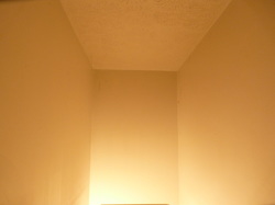
1. Space: Space is available area. The picture is taken in a residential house in the stairwell. In the picture you can see the available blank space. This is light is filling the positive and the dark is the negative.
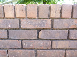
2. Lines: This is a picture of a brick wall outside my house. As you can tell there is 2 directions that the lines are going. This is a representation of horizontal and vertical straight lines. The lines help your eyes move left and right.
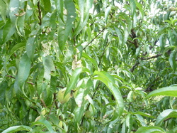
3. Color: This is the color green, the photo is taken from a peach tree. Even though it is one color the different levels of color show the different elements that are in the tree. Such as the unripe peaches, the tops of the leaves, and the bottom of the leaves.
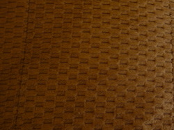
4. Texture:This is an up close view of my couch. You can see the texture of the couch. You are able to see depth and dimension.
4 Principles
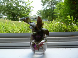
5. Focal Point/Emphasis: This is a picture of a plant in a window. The focus is on the plant. However, there is still foliage in the background.
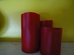
6. Contrast: This is a set of red candles against a yellow wall. The contrasting colors makes the picture have more impact. At first glance you see the red candles, but then they complement the wall.
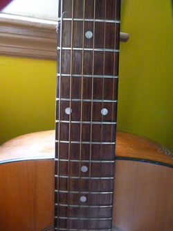
7. Rhythm: This is a guitar neck. It is a pattern, but you eye is moving as you look at it. The pattern flows and creates a sense of movement.
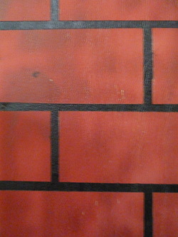
8. Unity: This is a closeup of an old Christmas decoration. However the painted on bricks show a picture of unity. The bricks are together and matching.
4 Laws of Gestalt Theory
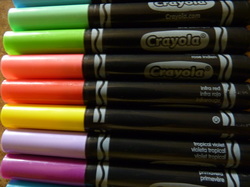
9. Proximity: This is a box of markers. They are all objects that belong together and are close together.
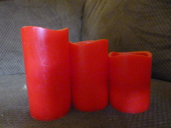
10. Similarity: This is a set of candles. All the same object, but different sizes. However they still belong together and create a pattern.
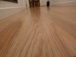
11. Continuity: The floor pattern looks as if it is one and moving in one direction. It creates a sense of movement and continuation.
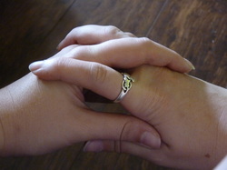
12. Closure: The entwined hands creates a sense of closure because they are together and in the frame you can see the beginning and the end.
4 Combinations of Elements/Principles
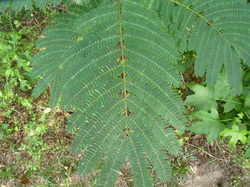
13. Balance/ Lines: This is a picture of a fern. It creates a sense of balance due to the symmetric layout. For lines, the lines of the plant stand out and draws you eye throughout the photo.
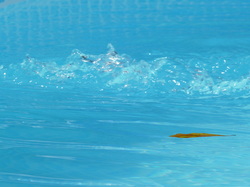
14. Movement/Color: This is a photo of a pool's filter. This shows the movement of the water. However the color blue makes the water moving stand out more.
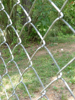
15. Focal/ Shape: The focus is on the fence, which is made of a diamond pattern. However you still have the background, but because the fence is the focus point that is why I chose this for focal and shape.
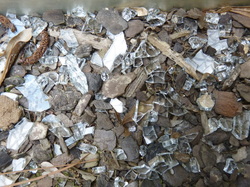
16. Contrast/Texture: This is a photo of my flowerbed, which happened to have a broken vase in it. The contrast colors of the bark, glass, and dirt makes the image visually appealing. All the while you can make out the texture of the glass and the wood chips.
Reflection:
The assignment was interesting because you really had to look and think about what you could use to visual these elements. As for the classroom setting, because I teach math, I think it might be interesting for my students to find real examples of geometric properties. For example a pair of parallel line, which might be a picture of a road painted, or a right angle might be a picture of a corner. I think that would make them be able to apply the definition better and maybe be able to grasp the meanings.
